Online Collaboration Environment - OnCE
SOIC@IUPUI.

RentOCenter is a solution to the primary issues of rental office customer service. Our aim was to fulfill the mission of the rental apartment executives, to provide excellent customer service and keep them always connected.
Each leasing office in turn has to manage all their internal activities including advertising, customer inquiries, maintenance, tenant’s customer service, amenities, property management and so on. Our project focuses on designing a system to address the daily pain points of the leasing office employees. Although there are many applications available to manage the information related to the day to day activities of these offices, they have many limitations. We aim to provide a better solution by augmenting the existing systems and addressing the pain points for better support in managing the various activities of the leasing offices.
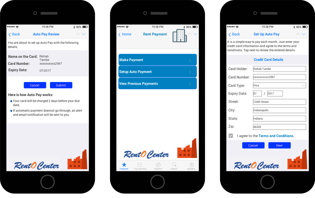
1. Paperless System: During our observation we identified that there is scope to design an automated system such that leasing office employee’s intervention could be reduced substantially.
2. Centralized System and Mobile application: If multi device interface made available to tenants, employees, guests and maintenance people that is going to cover more than half of the daily pain points of the leasing of office customer service personnel.
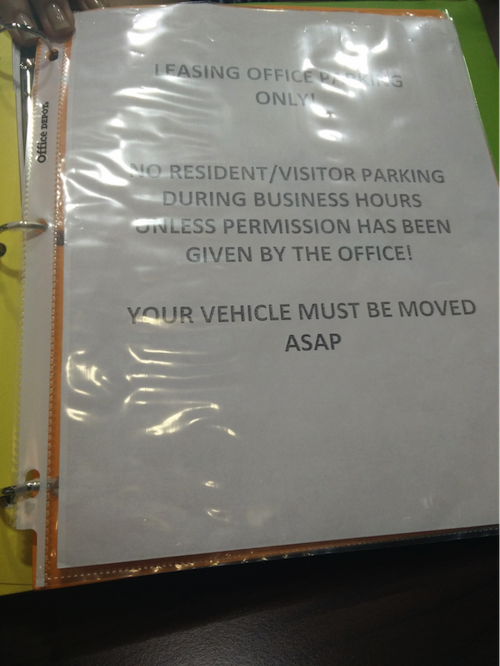
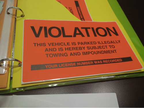
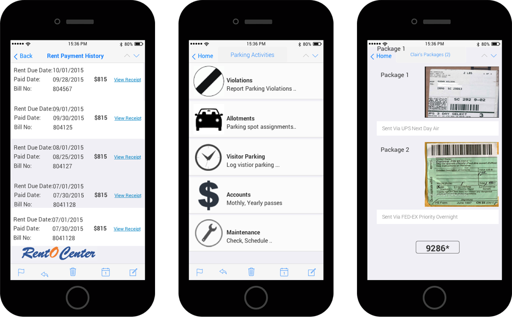
3. Parking Issues: The design strategies will include thing like scanning a license plate to report the violation at the same to issue the notice to customer. Another strategy is to explore the tag based entries and exit to the vehicles to generate automated parking logs of the vehicles with respect to the assigned spot.
Leasing office customer service is vast domain to explore, we interviewed and observed only few of them, if we were going to continue gathering data out next strategy would be to interview the different roles in the domain and to conduct a diary study. If we could provide the better designs to the problem we addressed, we will be able to cover more than half of the daily pain points of representatives.
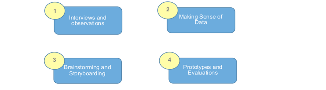
We performed three plus three contextual observations and inquiry sessions. During the process we collected all the possible information and artifacts. We then conducted meetings to identify the key areas and categorize the pain points. To gain more insights we brainstorm hundred solutions and narrowed them according to severity. Storyboards, empathy maps and persona revealed key aspects to address in designs. After multiple iterations at each stage we finally created an interactive prototype using justInMind.
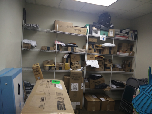
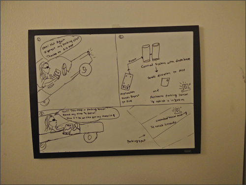
During interview and observation we came interesting artifacts in the process, which are helpful in understanding the daily pain point of the users. Manual parking Violation notification and package management was interesting to note since it was all tedious and was accomplished without the help of any applications.
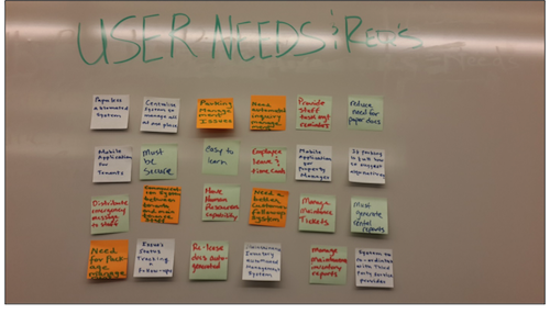
From the data collected by contextual interviews, we gathered large amount of information of tenants and leasing office employees needs and problems faced by them in context. The consolidated affinity diagram revealed profiles, roles, coordination, categories, influences, intents, and helped us to prioritize features.
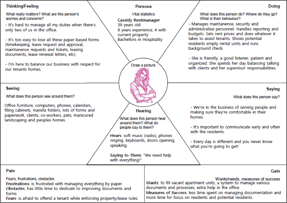
The team chose to use the Empathy Map method from the d.school Understand Mixtape. This diagram was chosen because it allows us to view our gathered insights from the stakeholder’s perspective. It becomes easy to see where this person can get frustrated and what about their work they need help with. The affinity diagram and following brainstorming session were conducted by all team members. Kyle created the Empathy Map, while Pankaj and Rehab reviewed it. The difference between the affinity diagram and empathy map is that with the affinity map you are gathering your observed insights whereas with the empathy map you use the target user’s perspective to place those insights into context.
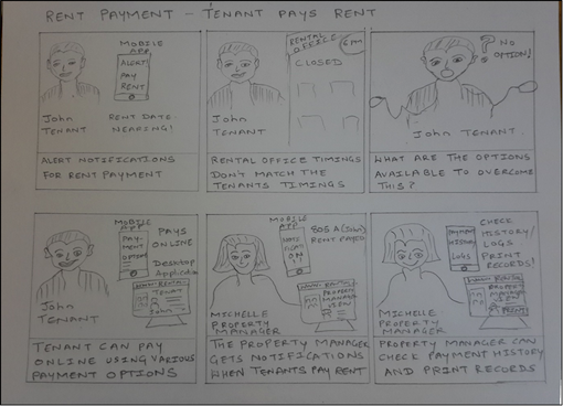
The storyboard illustrates three scenarios in which the application can be used. As we can see one of the users want to know and use the parking system effectively to avoid the future problems. Second story board reveals the use case of tracking the rent mostly useful for tenants. Last story boards portrays how the resident will have a key to access a storage locker that is assigned to their apartment unit. When the resident arrives and enters the pre-generated pin to access their package, the system sends a second email to the resident to inform them that their package has been received.
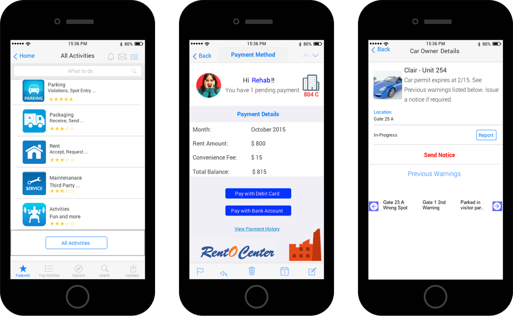
We built the high fidelity interactive prototype with JustInMind. JustInMind prototype helped us to observe the users in context and evaluate our design thoroughly. Apart from the fact that there is a learning curve if you aren’t use to this type of prototyping layout and the tools that come with it. Plus the Free version is very limiting which is a bummer considering it promotes itself as “The Best 100% Free Wireframe Tool for Mobile and Web”. We really liked overall experience of prototyping with JustInMind. If we were provided with extension of free version with premium features we would love to create more finished prototype and present it to the stakeholders.
The evaluation process, both self-reflective and the user driven think-aloud methods, were eye opening to the team in several ways. We were able to identify several usability issues and gain a concrete understanding of what our next steps should be, thanks in large part to the evaluations. For the think-aloud we selected two apartment property managers and had them use the application. The walkthrough and follow-up questioning took approximately 30-mintues and had the user’s complete three tasks:
1. Pick up a package from the rental office after-hours
2. Report a parking violation
3. Review and pay rent
The heuristic review, user-driven think aloud and cognitive walkthrough each identified both unique and similar issues. Starting with the heuristic review, it allowed the team to provide a critical, expert view on the prototype with a focus on best practice. This helped us understand that we were not following some basic design criteria, like speaking the users language concerning labeling. The user-drive evaluations were critical, they helped us understand that the target user demographic (tenants and property managers) really valued and approved of our application and its intent.
Some of the critical usability issues we identified included semiotics concerns with button labeling conventions. Users were particularly concerned with the ambiguously labeled ‘Activity’ button. The packaging system suffers from a lack of affordance for users and provides them with few clues as to how to apply the pin and physically retrieve their packages. The interface design must be rethought, with a focus placed on the personas we created and their needs and concerns. We should include a visual and accompanying directions to demonstrate the process; perhaps the next iteration can have a one-time overlay, tutorial.
Provided enough time with this project we would first conduct a card-sorting exercise with potential users to determine a better flow for our navigation and labeling conventions. We would then redesign the packaging system to include the above-mentioned tutorial with a visual example. This would need to include some better instructions and labeling on the interface. We would then retest this version of the prototype to determine how our initial design works.
SOIC@IUPUI.

Office Editing for Docs, Sheets & Slides
Academic Affairs @IUPUI